Portfolio for Visual Analytics with D3.js
A Library Juice course taught by Olga Buchel June 6-July 3, 2016
Click on the image to open the project
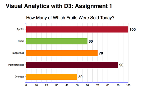
Assignment One: Bar Chart
Instructions: Create a bar chart for the following dataset: var data=[{"Quantity":"100","fruits":"Apples"},{"Quantity":"60","fruits":"Pears"},{"Quantity":"70","fruits":"Tangerines"},{"Quantity":"90","fruits":"Pomegranates"},{"Quantity":"50","fruits":"Oranges"}]; Show values on the x-axis, and categories on the y-axis. Make the x-axis a linear scale and the y-axis an ordinal scale.
View the Project's GitHub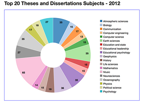
Click on the image to open the project
Assignment Two: Pie Chart
Instructions: Make a chart for your own data using any of the following layouts: 1) a pie chart; 2) a stacked bar or column chart; 3) a force layout; 4) radial tree layout. Add colors and labels to nodes. Nodes can have any shape explained in this lesson.
View the Project's GitHub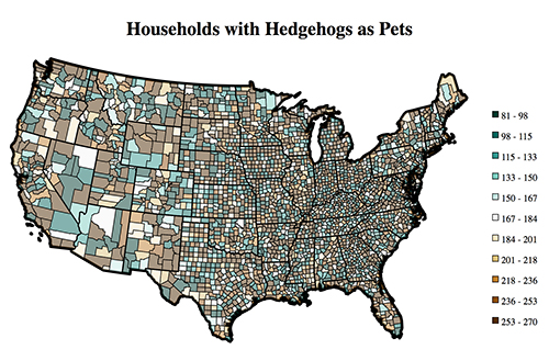
Click on the image to open the project
Assignment Three: Cloropleth Map
Instructions: Make a choropleth map. You can use my us.json file. Add values for states. If you can, add values for counties.
View the Project's GitHub
Click on the image to open the project
Assignment Four: Interactive Visualization -- Not yet complete
Instructions: Choose one of two options for this assignment: 1) Take any of the visualizations that you developed last week and add at least two interactions to it. The first interaction --- a tooltip with mouseover event. The second one can be sorting, filtering (I did not explain it but you can do it), zooming or animating; 2) Make a dashboard using Crossfilter and DC.js. The dashboard may include as little as only 2 graphs.
View the Project's GitHub